Project: The Plaza Tavern, Pacific Werribee - Hoppers Crossing, Victoria
Architect: The Buchan Group (with specialist fitout design by Enth Degree Architects)
Project Team: Bruce Shaw (Project Director), Joanne Lo, Victoria Dragas, Mark Kozakiewicz, Tom Griffin (and Kon Karakolis from EDA)
Town Planning: BMDA Development Advisory
Structural and Civil Engineer: Calibre Consulting
Services Engineer/Energy Consultants: ADP Consulting
Landscape Architects: Formium
Fire Engineer: Arup Fire
Acoustic Consultants: Watson Moss Growcott
Disability Consultants: Architecture and Access
Building Surveyors: Gardner Group
Builder: Probuild Constructions
Window Fabricator, Glazier or Installer: IND Window Fabrications
Principal Glazing: EVantage™ Bronze Double Glazed Units, VLam™ Hush, Seraphic™ Design
Size: 3,500 sqm
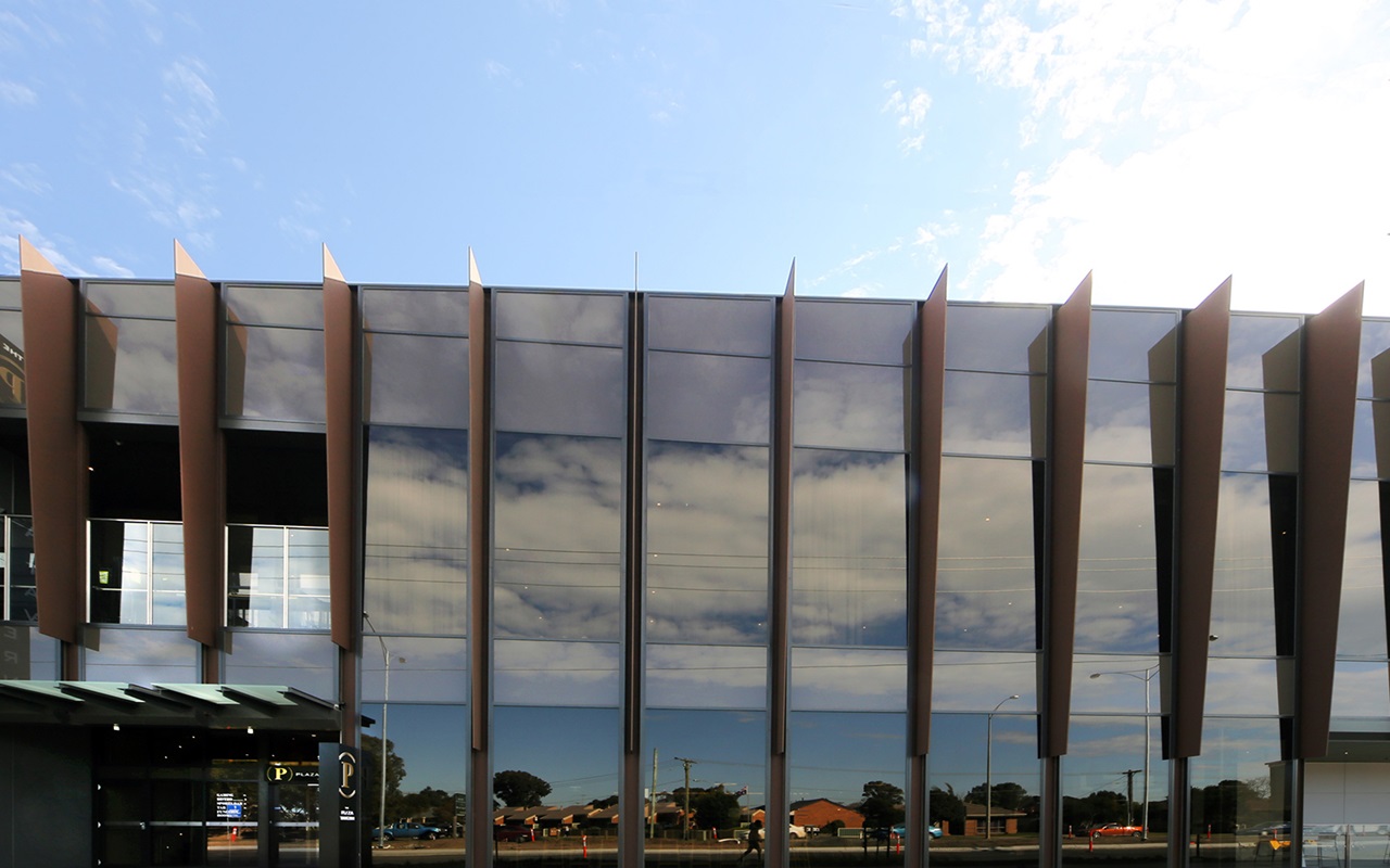
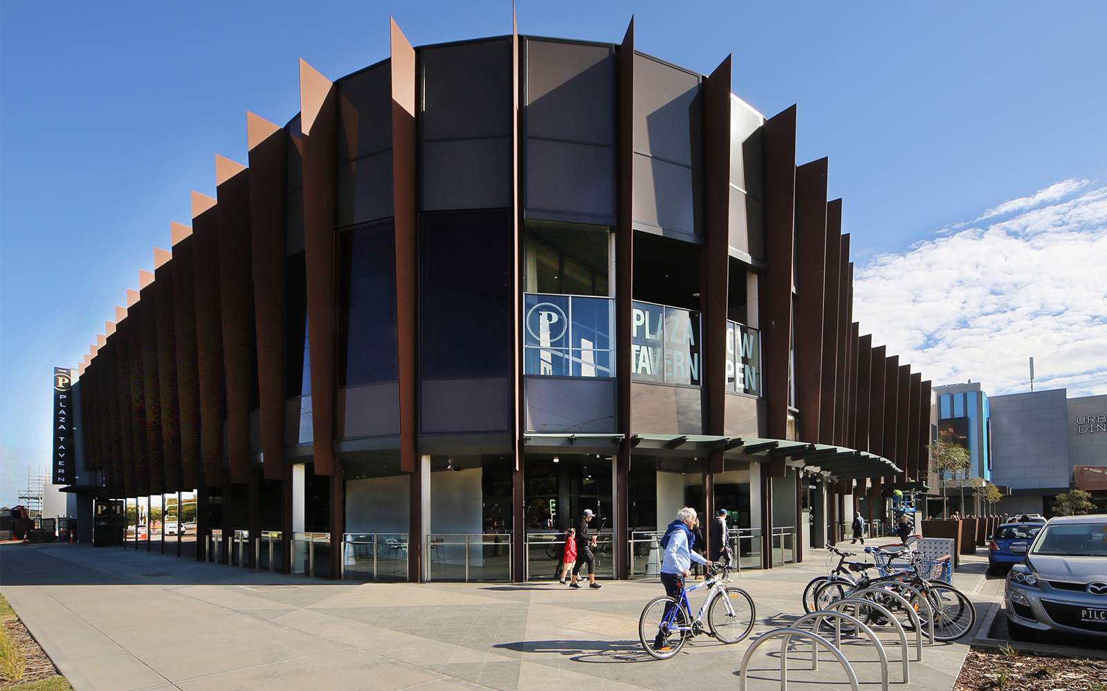
Viridian EVantage™ Bronze is pivotal to the glass and steel envelope of the Plaza Tavern, Hopper’s Crossing. With super solar performance, many of the double-glazed units comprise acoustic glass for the in-demand nightclub component. On a streetscape, or highway more commonly home to warehouses and discounted shopfronts, this beckons with a cool sophistication.
Werribee Tavern 30kms south-west of Melbourne’s CBD, in one of Australia’s Formula One growth corridors, has no shortage of haste and ugliness. Thankfully a surprise salvation is only just around the corner.
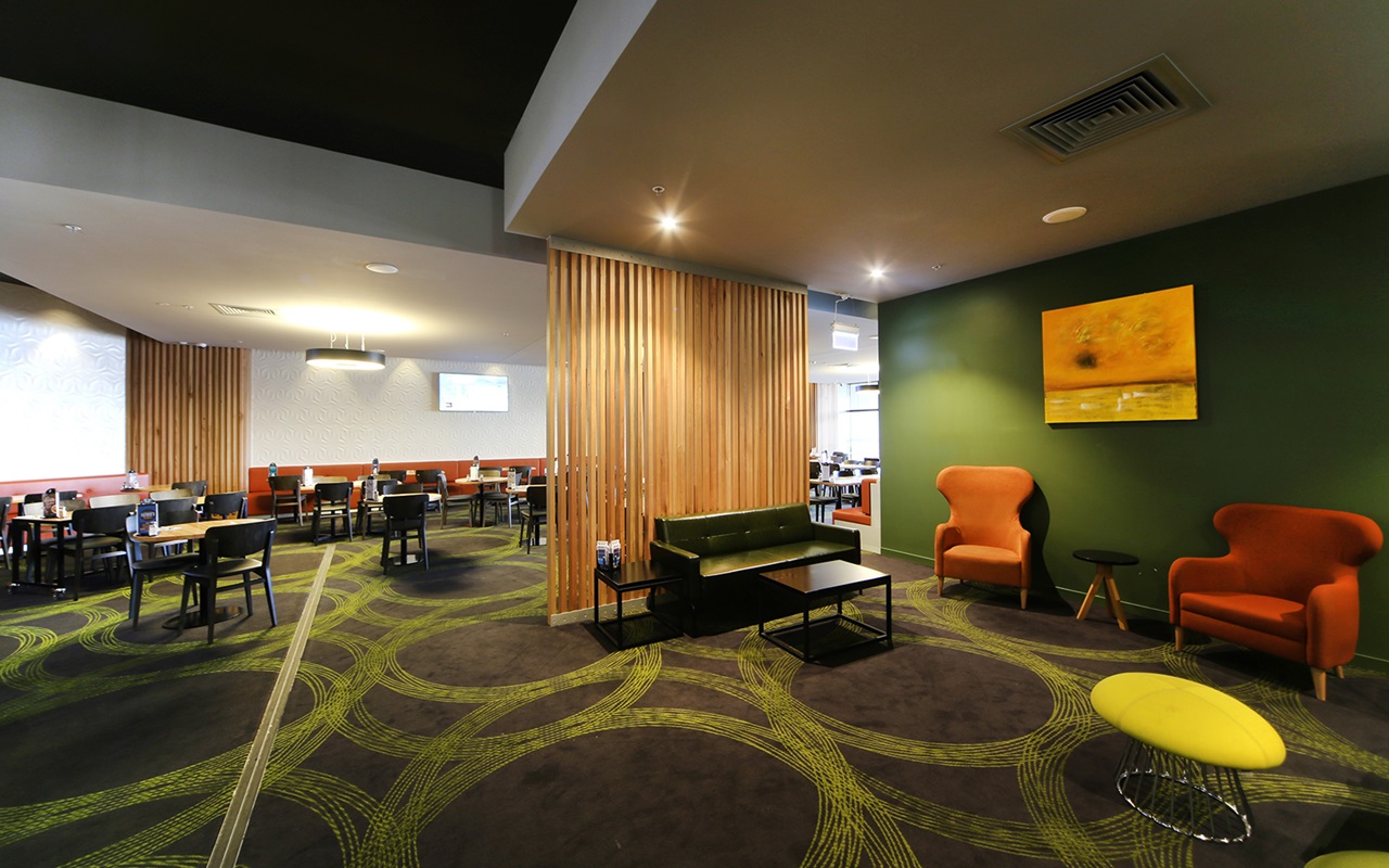
The Plaza Tavern, near the intersection of busy Derrimut and Heaths Roads, is a shining example of understatement among some noisy retail spruikers. Designed by the Buchan Group with a vast body of work in the retail sector, the Tavern lends a calm dignity. Its array of offerings range from ballroom to gaming, bistro to nightclub — all housed in a slick curvilinear form that doesn’t shriek at passers-by.
A new cinema complex sits immediately adjacent and just nearby, a shopping mall. It was important though that a clear distinction be made between general retail and a predominantly adult facility. Buchan architects have excelled at their task.
Vision spoke with project leader Mark Kozakiewicz about a retail precinct with a quite bespoke glass and
steel presence:
PH How challenging was it to introduce good design to development where the value of real design
is not always recognised or appreciated?
MK Because you may not know the constraints, or tenant, you can’t always anticipate occupant’s needs. It’s very difficult to produce a neutral design that is fully adaptable to everyone in every circumstance, so it is difficult, yes.
How strong is the temptation to produce the generic, proven and therefore safe concept? Your design has an attitude about it that provides a real edge.
Times are changing and you need to compete against other centres, so it can no longer be boring and safe.
It needs to be comfortable with a degree of design that attracts, in many cases, sophisticated tenants.
How strong is the demand from tenants for a design-led response to help attract the punters?
Tenants are now pretty on top of the game because they are using design that is necessarily deliberate.
They know what works, what has worked in the past, and what doesn’t work.
What was the main challenge and main opportunity? It’s not just about high visibility. It’s not just about look at me, is it?
No, it’s a about creating an environment that has some staying power and doesn’t quickly tire people. It needs to appeal to and excite visitors, rather than see them walk by to their destination. That is the challenge. People aren’t just going to come here if we’re lazy. You need to attract them and give them a reason to visit.
It’s definitely not a loud building in the way we often associate with pubs, clubs or gaming venues.
There’s a responsibility to the street along with the wants and desires of local authorities. You don’t want to end up with highway architecture. This building was designated as a stand-alone. It wasn’t designed as part of the
shopping centre.
Its other strong quality is the rhythm of the blades and sizeable window panels. Those two parts bring together sun shading and a quite striking affect.
We used bronze glass and it’s quite unusual for us. Bronze glass really does give the building its own identity. The neighbours are either clear or grey and this was one other way to make sure it was not confused or seen
as part of the adjacent shopping centre.
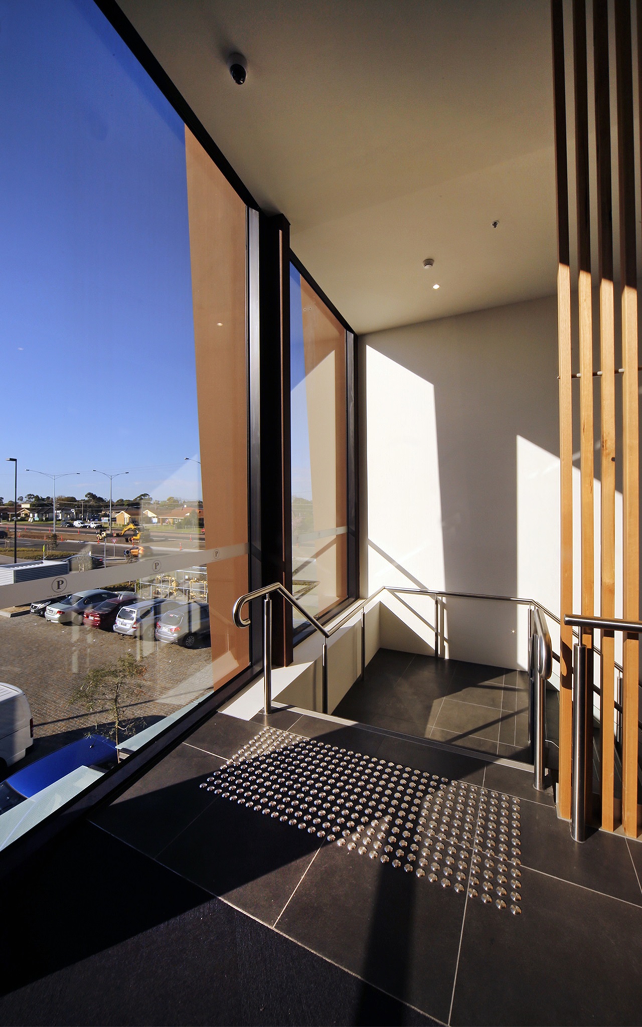
“The seraphic dot pattern and feathered edge of the canopies, really is an investment in that quality of experience and refuge from the elements.” Mark Kozakiewicz, Project Leader
How important is longevity on these projects?
The unusual aspect about this building is that it was designed about five years ago. It took a very long time
to finally be built because of all sorts of leasing restraints. What is pleasing is that the design has lasted reasonably well and still appears fresh and strong.
What else sold you on the strength of this specific palette of glass?
The solar control of EVantage™ Bronze worked for us in combination with those areas which use acoustic glazing. Solar control is the major factor because there’s so much glass. The tint looking out remains neutral and provides quite a degree of privacy.
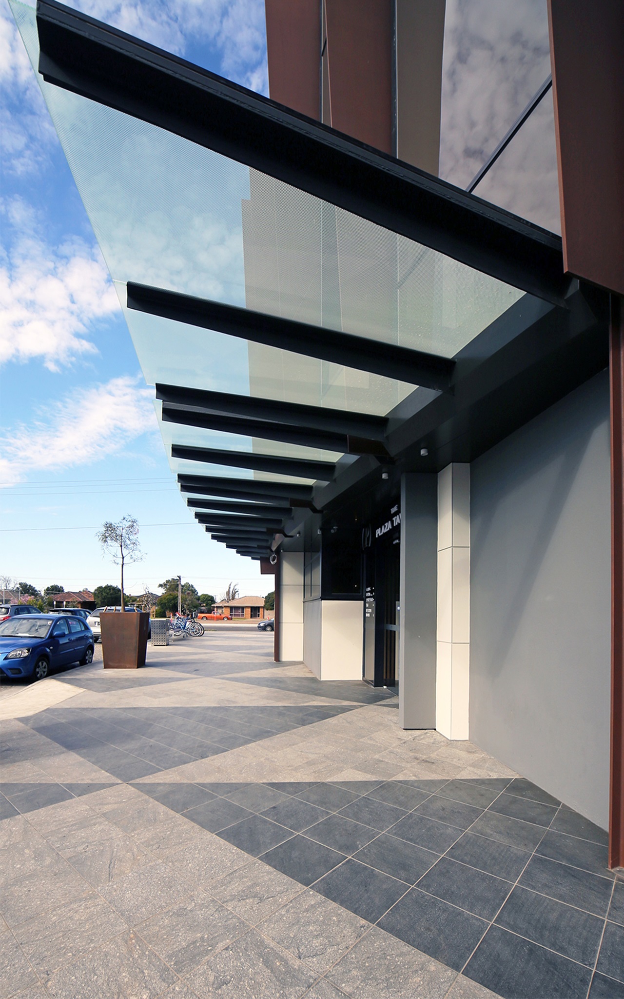
There’s additional feathering at the edges with canopy glazing that really creates a softer transition zone, shade and shelter.
That’s true and it maintains the idea of lightweight form, suspended above the passer-by as a soft, transitional shelter rather than a solid veranda with hard shadow-line. The seraphic dot pattern and feathered edge of the canopies, really is an investment in that quality of experience and refuge from the elements.
How conscious were you of minimising the appearance of mullions you often expect in such a building?
It was crucial to minimise their impact and to let the steel blades and glazing represent the skin rather than introduce other elements. The point of it is to conceal supplementary framing and celebrate that uniformity of colour and fluid, rhythm of the ‘skin’.
Is there a design highlight for you?
The part that turned out even better than expected was the exterior color. We wanted the steelwork, the blades to resemble Corten steel without the risk of rust stains on other surfaces. We found a paint that simulates Corten and in combination with Viridian’s Bronze EVantage™ the results really explain the subtle impact and success of this place. Building contractors, Probuild, were extremely responsive to our design requirements.
Did you consider any other facade alternatives to this? Or you were pretty committed to it from the outset?
No, we were pretty much committed to it. That is what we wanted.
Is there anything else about the glazing you consider important?
We went through a complicated process of prototypes to arrive at this solution, particularly for the spandrel effect. It’s very, very difficult without actually seeing an assembly in a mocked-up form, to choose glass. Viridian provided prototypes and we were able to choose the optimum match of glass from various combinations.
How was your experience of Viridian on this project?
I think the beauty of Viridian is the technical knowledge and background of its people. They’re very, very good.
They are supportive and fast to come back with answers to our queries. The other really important point is honest warranty support. You know you’re going to get warranty support whereas the same can’t always be said for product sourced from overseas. Who’s to say who will be around for warranty support in two or three years time if replacements are needed for faulty imported product?
Gallery List